Monday, 27 January 2014

Contents Draft 2


Here is a second draft of a contents page.  I tried a slightly different layout to the one I used before, however not too different because I quite liked the one in the first draft.  I've also made some of the improvements that I identified from my first draft, by;
  • adjusting my layout 
  • adding a band index 
  • adding a picture with the editor's note
  • adding the editor's contact details
  • including the magazine's website address
  • giving credit to photographers
  • shrinking the size of the 'CONTENTS'


My first draft was good but could have been better
Second draft, improvements on the first
have been made


However, I prefer the subtitles of the contents in the first draft because they stand out more...


Here I've done a diagram to illustrate the things I've drawn from other magazine contents pages.  I've circled the 'cover story' markers because I want to add those to my next draft

Monday, 20 January 2014

First Contents page draft


This is my first draft of my contents page.  I'm pretty pleased with it, although I know there are some things I could possibly improve on. 
I took inspiration for my layout from an issue of K! that I posted a few weeks ago...


Comparing the two layouts, I now see that the text that says 'CONTENTS' is maybe a bit too big and dominates the page more than it should.
Furthermore, when reflecting on the contents pages I made a comment about using markers to emphasise the  cover stories, which I didn't end up doing.
When I make improvement on this draft, I'll use the markers and adjust my layout

Monday, 13 January 2014

Improvements on my first draft

After making adjustments
Before making adjustments


I've moved the masthead further to the left to make it look more like a magazine front cover and less like a poster.
To make the main sell line stand out more, I've added the purple box behind it.
I've moved the teasing contents panel to the bottom as I thought it might just look a bit better there instead of further up.  It also helps to bring more attention to the main sell line, along with the purple box.
I was also informed that the masthead didn't seem to match the style of the rest of the front cover.  To overcome this, I changed the bars behind the text from grey to purple to bring it into the colour scheme. The same thing would be done with each issue, depending on each individual colour scheme.


Thursday, 19 December 2013

Rock Makeup Moodboard


Here I've made another moodboard, this time to collect ideas for make-up for my models to wear in future photoshoots.  
Conventions:  Dark/bright colours (Black, dark silver, bright red, purple, dark green)
Dark/red lipstick
Heavy eyes
Black eyeliner
Lack of blusher

Wednesday, 18 December 2013

FIRST DRAFT

 
This is my first draft with the main image being my own original image.  Although I'm happy with this first draft, I want to use an image with a black background and more interesting lighting like the one in my mock-up.
I've used the knowledge I learned in making my mockup to create this draft, ensuring I didn't make the same mistakes as before. 

Editing photo for front cover

Here is the original photo taken for my front cover.  I chose to take a MCU because it's quite conventional for magazines to use this kind of shot on the front cover of a magazine.
I left a blank space at the top of the image, keeping in mind that i would later need to fit the Masthead in.  However, I didn't make the space so big that the image would need cropping, as this would reduce the quality of the image.
I'm going to give the models coloured hair, darker makeup and tattoos to give them a more rock-inspired look.


Hair

Here is the image opened in PhotoShop CS6, the software I'm using to create my media product alongside PhotoShop CS5.
I've zoomed into the area I'm editing and created a new layer ready to start colouring over the hair.


I've roughtly painted using the brush tool over the hair in a lilac colour and used the mask effect 'Soft Light' to make it look natural.
Because I've only painted it on roughly, there is a halo of colour around her head.  Because the coloured layer is seperate to the image, I'll be able to remove the using the eraser tool without it affecting the image.


Because there were parts of the hair which were thinly covering the skin e.g. over the ear, I've reduced the opacity of the eraser tool to 50%.  This gives the appearance that the hair is still coloured but it looks natural because that part of the hair should appear less bright than the rest, with it being a thinner piece of hair.


I've repreated the same steps with a different colour on a different layer mask to give the second model pink hair.


Makeup

Dark red lipstick is something of an icon among female rockstars.
To apply red lipstick I used the brush tool to apply a red colour and used 'colour burn' mask effect.


To darken the colour, I duplicated the layer and reduced the opacity of the duplicated one until I achieved the desired colour.
I've added dark eye makeup using the brush tool and using the layer mask effect multiply


Tattoos
Employing the techniques in the YouTube tutorial I posted, I've used an image with a white background and copied it into the image


The 'multiply' layer mask effect removes the white background.
I've transformed the image to be around the correct size


I've warped the image to give it a more 3D shape to make it look like it follows the curve of the arm.


Here I've erased the rest of the image

I'll use the same technique to add the other tattoo


General Editing/Finishing Touches


I've adjusted the levels to brighten the image and correct the contrast

I've also adjusted the colour balance - giving the highlights a cyan hint, the midtones a magenta hint and the shadows a purple hint.  This helps the image match the colour scheme and makes the image generally more appealing to the eyes.


Before and after

Draft photos

While this photo has good compostition for a front cover photo, because there's room for a masthead and sell lines, I don't feel the outfit of the model matches the genre or represents my target audience well enough

This photo is not very well composed because there's not a lot of room for the Masthead
This photo is quite good for a front cover image because there's room for a masthead and the screamer.
The outfits also fit the genre well and represent my target audience.  Furthermore, a rock magazine is likely to have a band of people on the front rather than just one or two people.
The pose makes the three look like a band because they look comfortable around each other, as a band naturally would be.
The pose is also good because it suggests that the girl in the middle is the front woman; something that bands almost always have.
This photo is also good for the same reason as above.
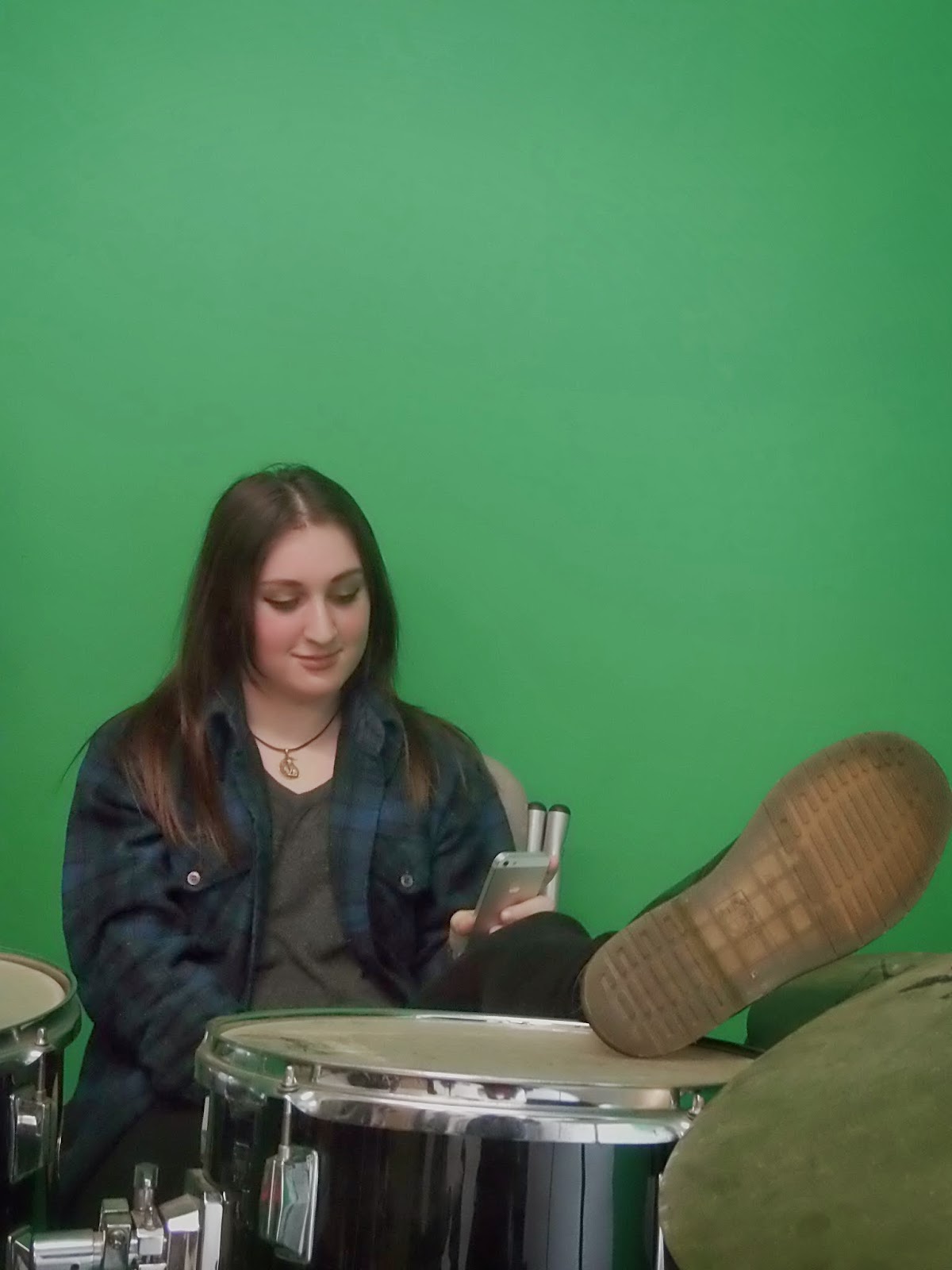
This photo might be good to use for the DPS, because instead of the cool, pose which would be good for a front cover; this photo reveals emotion and has a more casual feel to it.  DPS articles tend to reveal more about the artist and adopt a more 'casual' attitude than front covers, so this photo would be good to use because it matches the nature of a DPS
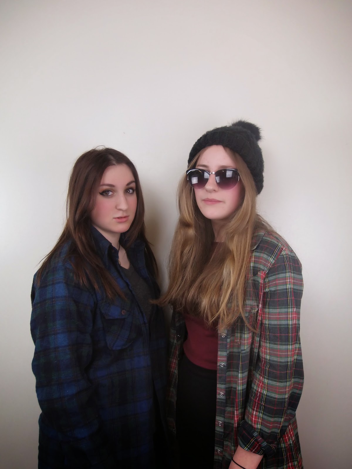
This photo, although fairly well composed, is not very good for a front cover for two reasons I've already discussed.  Firstly, rock magazines rarely show just two people on the cover because it's more often single artists or rock groups that feature on the front.  Secondly, the pose looks awkward which gives the impression that the two aren't comfortable together, which wouldn't be the case if they were partners in music

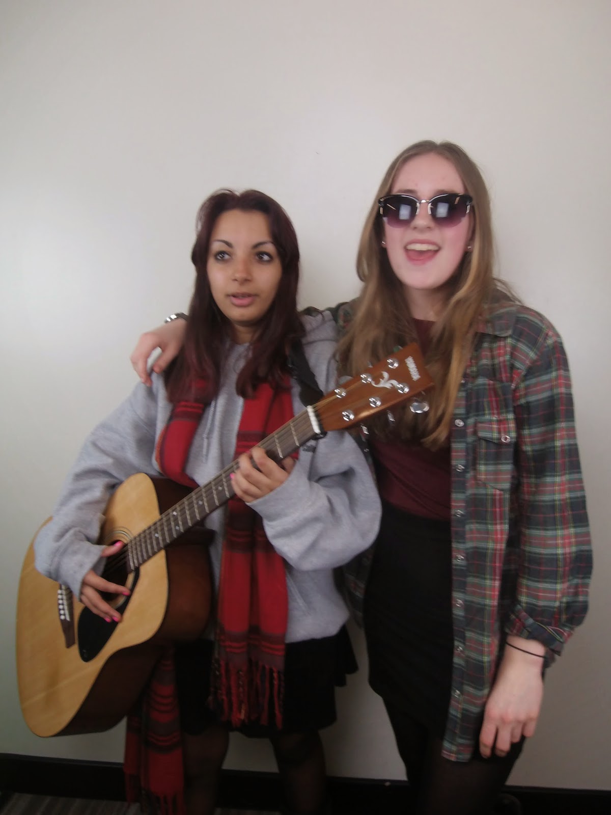
These photos would be more suitable for a folk music magazine due to the iconography of the acoustic guitar and the fact that duets are a lot more common in the folk music scene than the rock scene.


The composition is good, and there's the iconic rock horns which help the target audience to identify with the magazine.  However, the pose looks slightly awkward and, again, it's a pair.
The girl on the left's face is blurred.  Other than that,  this photo might also be good to use as a DPS image due to the revealing of emotion which is suitable because of the reasons I discussed before.


These photos would be good for DPS article because they, again, have a casual feel to them which more matches the purpose of the DPS article.


This photo would be completely unsuitable for a front cover because the top of the head is not in the frame.  There would be no room for the Masthead.

The composition and pose of this photo are good for a front cover, but the fact that it's a photo of two people makes it less suitable for the genre.


This is an example of a long shot which are almost never used on front covers.

The fact that the floor is visible in this picture makes it look amateur.