Name for my Magazine by Meg Noble on GoAnimate
Wednesday, 23 October 2013
Tuesday, 22 October 2013
Potential name ideas
I want to give my magazine a name that instantly resonates rock music - loud, crashing, rugged. So I used an online thesaurus to discover a wider range of possibilities from an extensive vocabulary. I've circled the words that have inspired me in red. Crash is a good place to start because it was the first word I thought of when I think of 'loud' and 'rock'; however, there is already an existing magazine called crash so I couldn't use that name.


'Detonation' has too many syllables to sound catchy when said aloud, so 'detonate' might be a better name.
'Dynamight' could be a good name because it includes the word 'might' which means strength and power - relating to rock music. But it's a bit of a long word so I'll use it in a mock-up to see how it looks.


Monday, 21 October 2013

Double Page Spread examples


Contents Page examples


 There is a lot of variation in contents page layouts for my chosen genre. This suggests that there are no real conventions in layout which makes me think that I could possibly choose my own; however, I think I'll try to follow the conventions of one magazine whilst choosing elements of others' that I like. The main and most important convention of a contents page is identifying the page number on which the different features are.
Secondly, there is again a consistent colour theme of red, black, white and sometimes yellow; similar to front cover colour themes.
It's also always stated clearly at the top of the page in big lettering what the page is and what time period it's for. There are normally lists of features with the page number next to each item. The most important features - logically the main image/sell lines - are the largest on the page or at the top of the list of contents.
Front Cover examples
Here are several good examples of magazine front covers that fairly closely follow my chosen theme. I will use these covers as general reference when looking for inspiration. I'm going to conduct LIIAR analyses of one cover, contents page and double page spread from each of the three magazines. This way I will have an extensive and inclusive base for detailed research.


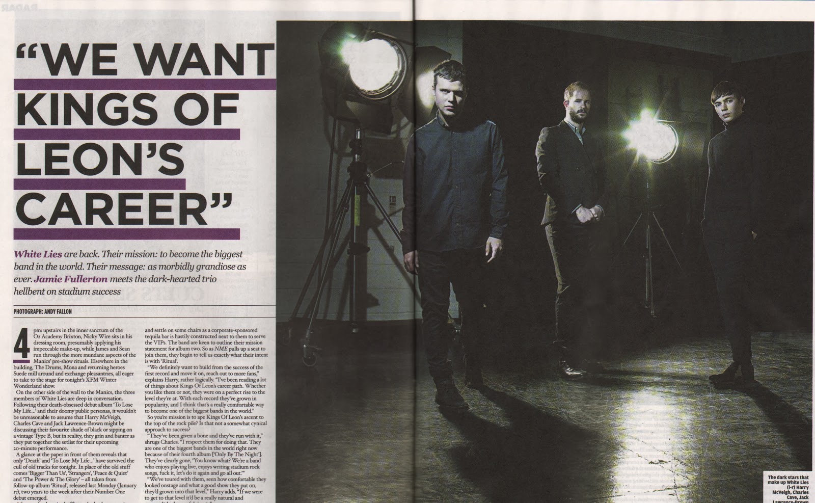
Basic conventions I can spot immediately are the use of bold, capitalised text (which reflects the loudness of Rock music); a CU/MCU of an artist or a MCU of a band in a striking and memorable pose; a short and attention-grabbing pull-quote of the featured artist that is from the article on them; diagonal text; use of red, black, yellow and white.


Tuesday, 15 October 2013
Monday, 14 October 2013
Evaluation
The magazine cover I’ve produced generally follows most of
the basic conventions I have stated in previous tasks where I looked to
existing similar covers. The use of
layout, masthead, sell lines, a sky line, main image of student(s), bar code etc.
all fit in with the basic conventions of a college magazine. This ensures that my magazine cover looks
professional and like a college magazine.
I’ve used a consistent theme colour to reflect the institution that I’m
trying to represent; in this case Wyke College. I used similar colours in the
main image to bring the whole piece together. However, unlike the other covers
that I analysed, I used colour to highlight key words in the sell lines to make
it more dynamic and interesting to look at. I’ve also used the same font for all the sell
lines unlike the other covers because I felt as though it looked better on my
particular cover, having used various colours and a relatively ‘busy’ main
image. I said, having used it on my
mock-up, that I might use vertical text on the cover to challenge conventions;
however decided against it because I felt that the main story text fitted
better horizontally. I made a fairly
successful attempt to use the rule of thirds when taking my main image, but
looking back in hindsight I would have made a more conscious and successful
effort because I feel as though the canvas images in the background are
slightly too low down in the image. I’ve
also noticed that the line is slightly vertical which, in my opinion, the cover
would look better and more professional if the line was perfectly
horizontal. Another convention that I’ve
slightly broken in my cover is the use of a medium long shot as opposed to a
medium close-up. I used this framing
because I thought it would work better with using more than one person in the
image. Furthermore, it’s not too much of
a drastic break of convention to make the cover look unprofessional and two of
the students are sat down which makes the break in convention hardly
noticeable.
If I was to do the
preliminary task again, I would have taken a simpler main image as I feel as
though my main image makes the text slightly harder to read than it should
be. I will bare this in mind when
conducting the main task. I would have
also used at least one male in the main image as I feel as though the image
I’ve used misrepresents the college as Wyke is a place where both males and
females attend; however I don’t think this is a major issue as it’s clearly
only a small representation of Wyke students.
Overall, having
conducted the preliminary task, I feel as though I have a decent grasp of
following magazine conventions and making decisions regarding these conventions
when producing a magazine front cover.
In making and identifying mistakes and breaking conventions, I feel as
though I have learnt even more than if I had not done so. I am mostly happy with the outcome of the
preliminary task and feel as though it is useful as preparation and
introduction to the main task.


Subscribe to:
Posts (Atom)