I asked 13 people of my age group how they'd rate - on a scale of 1 to 10 - the name 'Belt' for a rock music magazine.
The range was 6 - 10, meaning no one thought that the name was below average.
The mode was 8, with 5 people giving this result
The average (mean) was 7.5/10
I think I've found a good name for my music magazine, however I'll keep asking people and if I seem to get more negative feedback than positive, then I'll reconsider. For now though, I'll stick with 'Belt'
Tuesday 19 November 2013
NEW NAME IDEA!
Belt
It connotes rock music because a lot of rock singers 'belt' when singing. It's short and snappy as well. However, I'm a bit unsure because it doesn't have the same punch as 'Clash'. I'm going to do a survey about this name to find out what others think of it.
"How would you rate from 1 to 10, 1 being 'terrible' and 10 being 'perfect'; the name BELT for a varied rock music magazine?"
Hand Drawn Drafts 1
 I don't really like the colours I've used here. They don't really connote rock music when used together, and just look wrong. I like the layout though, but it needs more sell lines.
This is a bit simplistic and I should probably use more images. But I like idea for the main image.
Monday 18 November 2013
Survey Results 1
I've only received back 16 surveys and I'm yet to do more. (at least 25 in total)
Out of 14 people, the average rating for the name 'Clang' was: 6/10 (Just above average)
General attitude on the name 'Clash' : It got the most positive feedback
'Suits the genre' ... 'Catchy' ... 'Very good' ... '10/10' ... 'Better than Clang'
BUT
'It's already taken.'


People had a fairly indifferent attitude towards the other names 'Dynamite' and 'Detonate', with some saying they really didn't like it, and a few others saying it was more suited to RnB than Rock.
Some even said that it reminded them too much of the magician Dynamo!
So, for the rest of my surveys, I'll cross out 'Clash' and replace it with 'Smash' to see if the feedback for that name is just as positive as that for 'Clash'
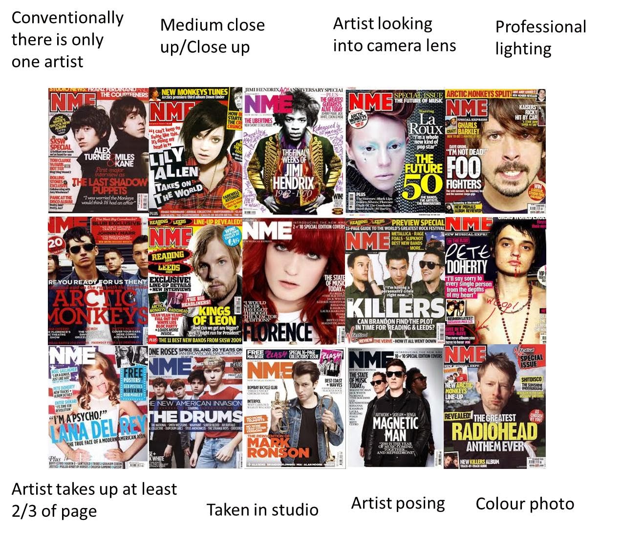
Contents Pages brief analysis/comparison


In reflection, I feel as though I prefer the old NME and Kerrang! contents pages (in comparison to the new NME contents page of which I conducted a LIIAR analysis), and feel as though briefly analysing and comparing these examples would help me along with the other LIIAR analysis.
I prefer the layouts of these contents pages because the other one was too much like a newspaper, whereas I'm making a magazine; and want it to look like one.
Similarities:
- Clear and large title at the top of the page
- Large, capitalised, blocky fonts
- Main image that takes up at least 1/3 of the page
- Black, white, red and yellow colour scheme.
- Markers to distinguish which articles feature on the front page (I like this idea and will definitely use it when drafting. I always find it helpful, when reading a magazine, to be able to easily find the articles that caught my eye in the first place.)
- The contents lists are sectioned off, with titles that use the same housestlye each time. This makes it easier to distiguish where the titles are therefore where each kind of story is listed; in turn making it easier for the reader to find what they want.
- Editors note with contact details.
- Credit to the Photographers in small print, vertically at the bottom left of the page.
- Advert for subscribing to the magazine; placed in the contents (at the front). This placed in the contents because it will only appeal to those who have already bought at least one copy of the magazine. It wouldn't be on the front because 1) it would take up too much space considering that 2) there's a chance that the person looking at the cover hasn't even bought one copy yet, so why assume they'd be interested in subscribing?
- Most of the 'stuff' on the page is arranged in columns. Some pictures are landscape and in NME the editor's note is too; probably to make it stand out against the contents columns.
- In NME's colour scheme, red and white are the most predominant colours, whereas in Kerrang!, they're yellow and black.
- NME has a band index as well (I like this)
- Kerrang!'s main image takes up 1/2 of the page, whereas NME's main image takes up about 1/3.
- In Kerrang!, the main image and contents list are definitely predominant against everything else on the page. In NME, everything has a much more equal amount of space. Personally, I prefer Kerrang!'s layout, because it's more simple and clear, and my eyes know where to look. NME seems a bit busy, cluttered. I just prefer looking at the Kerrang! contents page as the layout is easier on the eyes.
- NME bares a slight resemblance to a cheap 'real story'/celebrity/TV magazine, because of the fonts used. I prefer the fonts used on Kerrang!'s contents page as they're a bit different and just seem more suited to a rock magazine.
- Kerrang! has a picture of the editor. I like this because it creates a more personal relationship between the reader and the editor as the reader can put a face to a name. It also shows that the editor has nothing to hide as he doesn't mind his readership knowing what he looks like; this might help the reader to trust the content of the magazine more easily.
- Kerrang! has small images of the double page spreads to entice you to read them. (I'm not sure I like this because it spoils the surprise)
- I'm going to go for a more defined layout like Kerrang, but in drafting I will take bits and pieces from NME's layout
- Band Index
- Use a font that's not really commonly used
- Black + White + another colour = colour scheme
- Subscription advert
- Highlight what's on the cover
- Section parts of the contents
- Include a picture with editor's note
- Space the cover stories apart so the reader's eyes scan over the other stories. (Same applies to where the stories go throughout the actual magazine; so that when the reader flicks through, from one cover article to the next, they read the other articles in the magazine)
Survey about magazine names...
Hi there! I’m currently deciding the name
of my media music magazine and would appreciate some feedback from others. Please take 30 seconds of your time to answer
a few easy questions. It would be a huge
help!! J
1.
On a scale of 1-10, with 10
being ‘huge fan’ and 1 being ‘not at all interested’ how much would you say you
are interested in/like the rock music genre? (Please circle)
1 2 3 4 5 6 7 8 9 10
2.
Do you/have you read rock music
magazines? Yes No
If you have given a rating below 4 on Q1 and/or said
NO for Q2 you don’t have to answer the following questions. Thanks for your time!
3.
How would you rate, on a scale
of 1-10 (1 being ‘terrible’ and 10 being ‘perfect’) the name ‘Clang’
for a rock music magazine? (Please circle)
1 2 3 4 5 6 7 8 9 10
4.
What do you think of these
other ideas for the name of a music magazine?
‘Clash’
___________________________________________________________________________________________________________________________________________________________________________________________________________________________________________________________________________
‘Dynamite’
___________________________________________________________________________________________________________________________________________________________________________________________________________________________________________________________________________
‘Detonate’
___________________________________________________________________________________________________________________________________________________________________________________________________________________________________________________________________________
Additional
Comments
___________________________________________________________________________________________________________________________________________________________________________________________________________________________________________________________________________
__________________________________________________________________________________________________________________________________________________________________________________
Thank you for
your time; your help is much appreciated!
Please return this to me (Meg) when you’ve finished! J
Wednesday 13 November 2013

Under the Radar


I like the look of these main images and how they've been achieved. They're creative, unique and pieces of art in themselves. I'll take inspiration from these when taking my own images as I believe it will make my magazine more stand-out against other rock magazines.
Tuesday 12 November 2013
LIIAR Analysis of NME contents page

 |
| Examples of broadsheet layouts and conventions - similar to NME's |
This also may have been done because it's a clear and concise way of laying out information. Furthermore, the font used for the page's title is the same as that in The Times. The Times is a very British newspaper, so NME may be wanting to emulate it because it, too, is British, and they are trying to keep to these trademark conventions to in an act of patriotism; so the reader instantly knows that the magazine is from Britain. The main image for the main story is of the frontman of an English indie band. NME is a magazine that currently focuses on Indie Rock music in particular rather than just rock in general; and indie rock has its origins in Britain. In doing this, NME is further inkeeping with its proud British trademarks but also its own conventions as a magazine.
Ideology - The language used for the pull line in the main story represents the ideology in a big way. The fact that the word 'fucked' has been used shows that the magazine isn't conventional because a conventional, widespread magazine wouldn't use such wording. It also helps to emulate the rock and roll attitude of the magazine (as I've dicussed in the front page analysis)
Rock Iconography Moodboard

I find it very useful to create a moodboard for reference because it helps to consolidate everything that I'm trying to focus on. The process of creating the moodboard and gathering images has helped me to consider different elements of my chosen genre. This will be helpful in the designing, aesthetic and creative aspects of my magazine, for example; deciding colour schemes, adverts to be placed on the cover, how to represent my target audience through my main image (and other images), shapes, fonts, attitudes etc.
Tuesday 5 November 2013
NME Front Page LIIAR analysis

The colours used for the anchorage of the main image are gold, white and black. Gold is a colour that connotes quality, festivity and celebration, which matches the message that the text actually says. It suggests that the winners of these awards fit these connotations which reinforces the message. The white is used to contrast against the background and stand out, so the reader's eye is caught by the text. This increases selling power as the target audience is likely to be attracted to the main story. The black is used because it not only stands out against the gold, it also differentiates the artists' names which makes it easier and quicker to read. This also increases the selling power because the desired message is conveyed more quickly, therefore the target audience is enticed to buy the magazine with less hesitation.
The other stories and sell are scattered around the anchorage so the readers' eyes are led to them to further entice them to buy the magazine. They also arranged conventionally so the reader can find them where they would expect to find them. This again decreases the amount of time it takes for the reader to be encouraged to buy the magazine. They also relate to the main story, which suggests that this issue puts a heavy focus on particular artists and reviewing music and performers.
Ideology - The red background and rude gesture statuette connote an agressive and angry attitude which relates to rock and roll/punk music. The rude gesture award trophy suggests that the music style and their awards put a metaphorical finger up to any other music style's awards. The fact that the image has been included on the front cover for everyone to see gives out a message of edginess and apathy. This suggests that the magazine doesn't like to be pretentious or cover up its beliefs to please people. It also reinforces the honest and frank attitude that NME, its reviews and its articles are well known for.
Institution - The institution of the magazine publishers also publish Kerrang! magazine also who have a music channel. The institution is heavily focused on Rock music therefore want to stay true to it. In this way, they can guarantee that their market will remain loyal to them because it will be able to trust them. The institution can also be classed as the magazine itself. There is a consistent colour scheme that is demonstrated on the cover that brings the magazine together and presents itself as an institution. The fonts are all similar which suggests a house-style; making the magazine into a miniature institution.
Audience - The target audience is evidently males and females who like Rock music, as shown by the artists on the front and the other stories featured in the magazine. The arguably offensive gesture suggests that the magazine may be aimed young/middle aged adults, as it wouldn't be suitable for a very young child, and an older person may find it personally offensive therefore wouldn't be inclined to buy the magazine. Furthermore, the audience for rock fans are generally also of this age; Foo Fighters (band of which Dave Grohl is the frontman) fans' age ranges from 14 to 45 - maybe even 50. Through including such a widely popular artist on the front, the magazine is appealing to a larger audience; even though the magazine's audience is specified to rock fans.
Representation - The main icons that represent the magazine are the prominent statuette, the colours used, the artists' appearances and seeming attitudes through their appearances. The inclusion of the statuette suggests that the magazine is giving out a message of rebellion; perhaps against other magazines. The dark clothing of all the artists, red hair and black lipstick, long hair and beards are all also rebellious against society's conventions. They are also all parts of the iconography associated with rock and roll. This helps to represent the magazine as a rock magazine more easily. The aggressive red background ties together the slightly aggressive, loud and rebellious message that the magazine is trying to portray. The artists chosen to feature on the front of the magazine are not only popular in the rock scene, they also have stereotypical appearances of those who partake in the rock lifestyle. Through this, the magazine is also representing its audience through the media language. This helps the magazine to sell itself to the right audience, which would be in-keeping to its attitude of loyalty to rock music. Vice-versa with the audience; they buy the magazine knowing that they are being represented and representing themselves in the desired way.
Monday 4 November 2013
Reader profiles


Reader profiles are important to enable a magazine to make money. Companies (such as record labels) pay thousands of pounds to feature their advert in a magazine. For companies to invest in such an advert, they need to know that by putting it in a certain type of magazine, they will be reaching the right audience to advertise their product. This is why magazines conduct reader profile research; to gain the trust of companies who will pay them to advertise.
Furthermore, magazines must know how to represent their and these such companies' target audience through the media language used throughout the magazine. This includes; the artists they write about/feature; the colours, fonts, layouts, iconography they use; and the attitude they uphold; as well as the products they promote as they go hand in hand.
The reader profile presents a type of people who are a full, rounded package. People -of specific age groups- who are not only interested in music, but also films, games, clothes, TV, social networks: even food and beverages.
The readership wants to be represented through and institute such as a magazine. A magazine is a form of entertainment in itself; therefore must include interesting and engaging things to satisfy the customer.
Because my magazine will be similar in target audience to some already out there, looking at existing reader profiles will help me to determine my own reader profile.
Subscribe to:
Posts (Atom)