Wednesday, 13 November 2013
Under the Radar
Tuesday, 12 November 2013
LIIAR Analysis of NME contents page

![]() |
| Examples of broadsheet layouts and conventions - similar to NME's |
This also may have been done because it's a clear and concise way of laying out information. Furthermore, the font used for the page's title is the same as that in The Times. The Times is a very British newspaper, so NME may be wanting to emulate it because it, too, is British, and they are trying to keep to these trademark conventions to in an act of patriotism; so the reader instantly knows that the magazine is from Britain. The main image for the main story is of the frontman of an English indie band. NME is a magazine that currently focuses on Indie Rock music in particular rather than just rock in general; and indie rock has its origins in Britain. In doing this, NME is further inkeeping with its proud British trademarks but also its own conventions as a magazine.
Ideology - The language used for the pull line in the main story represents the ideology in a big way. The fact that the word 'fucked' has been used shows that the magazine isn't conventional because a conventional, widespread magazine wouldn't use such wording. It also helps to emulate the rock and roll attitude of the magazine (as I've dicussed in the front page analysis)
Rock Iconography Moodboard
I find it very useful to create a moodboard for reference because it helps to consolidate everything that I'm trying to focus on. The process of creating the moodboard and gathering images has helped me to consider different elements of my chosen genre. This will be helpful in the designing, aesthetic and creative aspects of my magazine, for example; deciding colour schemes, adverts to be placed on the cover, how to represent my target audience through my main image (and other images), shapes, fonts, attitudes etc.
Tuesday, 5 November 2013
NME Front Page LIIAR analysis
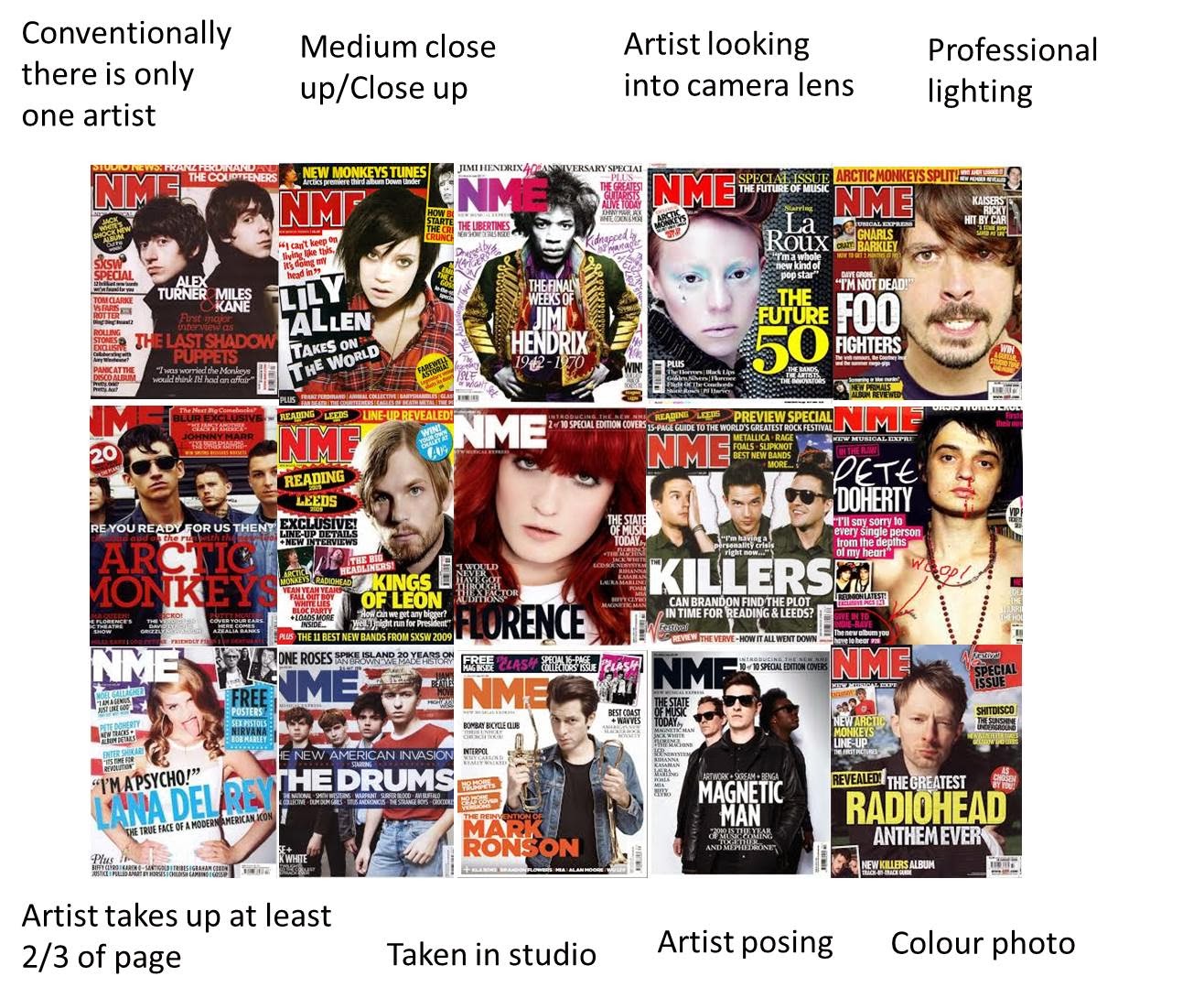
Language - The artists featured on the front of the magazine are well known in the rock industry so we can see instantly that this is a rock music magazine that focusses on these artists in particular. The people on the front also possess the various stereotypes of rockstars: coloured hair, dark makeup, beards and long hair on men and black clothing. This reinforces the stereotypes of the people that may like this magazine therefore helps the target audience to identify with the magazine. The people on the front who won the awards (the names are stated) are wearing formal clothes that people wear to awards ceremonies; which suggests that there will be more images from the awards inside the magazine as there are already a few on the cover. This entices the target audience to buy the magazine because it shows that the magazine is likely to offer to them what they want. The person in the foreground is holding a statuette of a rude gesture which connotes that the magazine is rebellious and perhaps rudely outspoken with a loud rock 'n' roll attitude. We can see that the anchorage for the main image is the 'NME Awards 2011', so we can instantly assume that the statuette that Grohl is holding must be one of the awards. This suggests that the award ceremony itself was not conventional and therefore reinforces the edgy rock n roll attitude that this front cover is portraying. This connotes that the magazine stays true to rock and roll and even when holding typically formal events, they have an edgy attitude.
The colours used for the anchorage of the main image are gold, white and black. Gold is a colour that connotes quality, festivity and celebration, which matches the message that the text actually says. It suggests that the winners of these awards fit these connotations which reinforces the message. The white is used to contrast against the background and stand out, so the reader's eye is caught by the text. This increases selling power as the target audience is likely to be attracted to the main story. The black is used because it not only stands out against the gold, it also differentiates the artists' names which makes it easier and quicker to read. This also increases the selling power because the desired message is conveyed more quickly, therefore the target audience is enticed to buy the magazine with less hesitation.
The other stories and sell are scattered around the anchorage so the readers' eyes are led to them to further entice them to buy the magazine. They also arranged conventionally so the reader can find them where they would expect to find them. This again decreases the amount of time it takes for the reader to be encouraged to buy the magazine. They also relate to the main story, which suggests that this issue puts a heavy focus on particular artists and reviewing music and performers.
Ideology - The red background and rude gesture statuette connote an agressive and angry attitude which relates to rock and roll/punk music. The rude gesture award trophy suggests that the music style and their awards put a metaphorical finger up to any other music style's awards. The fact that the image has been included on the front cover for everyone to see gives out a message of edginess and apathy. This suggests that the magazine doesn't like to be pretentious or cover up its beliefs to please people. It also reinforces the honest and frank attitude that NME, its reviews and its articles are well known for.
Institution - The institution of the magazine publishers also publish Kerrang! magazine also who have a music channel. The institution is heavily focused on Rock music therefore want to stay true to it. In this way, they can guarantee that their market will remain loyal to them because it will be able to trust them. The institution can also be classed as the magazine itself. There is a consistent colour scheme that is demonstrated on the cover that brings the magazine together and presents itself as an institution. The fonts are all similar which suggests a house-style; making the magazine into a miniature institution.
Audience - The target audience is evidently males and females who like Rock music, as shown by the artists on the front and the other stories featured in the magazine. The arguably offensive gesture suggests that the magazine may be aimed young/middle aged adults, as it wouldn't be suitable for a very young child, and an older person may find it personally offensive therefore wouldn't be inclined to buy the magazine. Furthermore, the audience for rock fans are generally also of this age; Foo Fighters (band of which Dave Grohl is the frontman) fans' age ranges from 14 to 45 - maybe even 50. Through including such a widely popular artist on the front, the magazine is appealing to a larger audience; even though the magazine's audience is specified to rock fans.
Representation - The main icons that represent the magazine are the prominent statuette, the colours used, the artists' appearances and seeming attitudes through their appearances. The inclusion of the statuette suggests that the magazine is giving out a message of rebellion; perhaps against other magazines. The dark clothing of all the artists, red hair and black lipstick, long hair and beards are all also rebellious against society's conventions. They are also all parts of the iconography associated with rock and roll. This helps to represent the magazine as a rock magazine more easily. The aggressive red background ties together the slightly aggressive, loud and rebellious message that the magazine is trying to portray. The artists chosen to feature on the front of the magazine are not only popular in the rock scene, they also have stereotypical appearances of those who partake in the rock lifestyle. Through this, the magazine is also representing its audience through the media language. This helps the magazine to sell itself to the right audience, which would be in-keeping to its attitude of loyalty to rock music. Vice-versa with the audience; they buy the magazine knowing that they are being represented and representing themselves in the desired way.
The colours used for the anchorage of the main image are gold, white and black. Gold is a colour that connotes quality, festivity and celebration, which matches the message that the text actually says. It suggests that the winners of these awards fit these connotations which reinforces the message. The white is used to contrast against the background and stand out, so the reader's eye is caught by the text. This increases selling power as the target audience is likely to be attracted to the main story. The black is used because it not only stands out against the gold, it also differentiates the artists' names which makes it easier and quicker to read. This also increases the selling power because the desired message is conveyed more quickly, therefore the target audience is enticed to buy the magazine with less hesitation.
The other stories and sell are scattered around the anchorage so the readers' eyes are led to them to further entice them to buy the magazine. They also arranged conventionally so the reader can find them where they would expect to find them. This again decreases the amount of time it takes for the reader to be encouraged to buy the magazine. They also relate to the main story, which suggests that this issue puts a heavy focus on particular artists and reviewing music and performers.
Ideology - The red background and rude gesture statuette connote an agressive and angry attitude which relates to rock and roll/punk music. The rude gesture award trophy suggests that the music style and their awards put a metaphorical finger up to any other music style's awards. The fact that the image has been included on the front cover for everyone to see gives out a message of edginess and apathy. This suggests that the magazine doesn't like to be pretentious or cover up its beliefs to please people. It also reinforces the honest and frank attitude that NME, its reviews and its articles are well known for.
Institution - The institution of the magazine publishers also publish Kerrang! magazine also who have a music channel. The institution is heavily focused on Rock music therefore want to stay true to it. In this way, they can guarantee that their market will remain loyal to them because it will be able to trust them. The institution can also be classed as the magazine itself. There is a consistent colour scheme that is demonstrated on the cover that brings the magazine together and presents itself as an institution. The fonts are all similar which suggests a house-style; making the magazine into a miniature institution.
Audience - The target audience is evidently males and females who like Rock music, as shown by the artists on the front and the other stories featured in the magazine. The arguably offensive gesture suggests that the magazine may be aimed young/middle aged adults, as it wouldn't be suitable for a very young child, and an older person may find it personally offensive therefore wouldn't be inclined to buy the magazine. Furthermore, the audience for rock fans are generally also of this age; Foo Fighters (band of which Dave Grohl is the frontman) fans' age ranges from 14 to 45 - maybe even 50. Through including such a widely popular artist on the front, the magazine is appealing to a larger audience; even though the magazine's audience is specified to rock fans.
Representation - The main icons that represent the magazine are the prominent statuette, the colours used, the artists' appearances and seeming attitudes through their appearances. The inclusion of the statuette suggests that the magazine is giving out a message of rebellion; perhaps against other magazines. The dark clothing of all the artists, red hair and black lipstick, long hair and beards are all also rebellious against society's conventions. They are also all parts of the iconography associated with rock and roll. This helps to represent the magazine as a rock magazine more easily. The aggressive red background ties together the slightly aggressive, loud and rebellious message that the magazine is trying to portray. The artists chosen to feature on the front of the magazine are not only popular in the rock scene, they also have stereotypical appearances of those who partake in the rock lifestyle. Through this, the magazine is also representing its audience through the media language. This helps the magazine to sell itself to the right audience, which would be in-keeping to its attitude of loyalty to rock music. Vice-versa with the audience; they buy the magazine knowing that they are being represented and representing themselves in the desired way.
Monday, 4 November 2013
Reader profiles
Reader profiles are important to enable a magazine to make money. Companies (such as record labels) pay thousands of pounds to feature their advert in a magazine. For companies to invest in such an advert, they need to know that by putting it in a certain type of magazine, they will be reaching the right audience to advertise their product. This is why magazines conduct reader profile research; to gain the trust of companies who will pay them to advertise.
Furthermore, magazines must know how to represent their and these such companies' target audience through the media language used throughout the magazine. This includes; the artists they write about/feature; the colours, fonts, layouts, iconography they use; and the attitude they uphold; as well as the products they promote as they go hand in hand.
The reader profile presents a type of people who are a full, rounded package. People -of specific age groups- who are not only interested in music, but also films, games, clothes, TV, social networks: even food and beverages.
The readership wants to be represented through and institute such as a magazine. A magazine is a form of entertainment in itself; therefore must include interesting and engaging things to satisfy the customer.
Because my magazine will be similar in target audience to some already out there, looking at existing reader profiles will help me to determine my own reader profile.
Subscribe to:
Posts (Atom)


